Do you want to create a mobile-ready responsive WordPress menu?
More than half of all website traffic comes from mobile devices. If your navigation menu doesn’t work well on smartphone and tablets, then a big chunk of your audience may struggle to find their way around your site.
In this guide, we will show you how to create a mobile-ready responsive WordPress menu.
Why Create a Mobile-Ready Responsive WordPress Menu?
A well-designed navigation menu will help visitors find their way around your website. However, just because you menu looks great on desktop computers, doesn’t automatically mean it will look good on smartphones and tablets too.
Mobile users make up around 58% of all internet traffic. That said, if your menu doesn’t look good or work correctly on mobile devices, then you risk losing half your audience. This will make it difficult to achieve key goals such as growing your email list, getting sales, and growing your business.
With that being said, let’s see how you can create a mobile-ready responsive menu that will look great on smartphones and tablets. Simply use the quick links below to jump straight to the method you want to use.
A responsive slide panel is a navigation menu that slides onscreen when a visitor taps or clicks on a toggle.

In this way, the menu is always within easy reach but doesn’t take up any onscreen space by default. This is particularly important since smartphones and tablets have much smaller screens compared to desktop computers.
If the menu is constantly expanded, then a mobile user may trigger its links by accident using their device’s touchscreen. This makes slide panels a good choice for a mobile-responsive menu.
The easiest way to add a mobile-ready slide panel is by using Responsive Menu.
Note: There is a premium version of Responsive Menu with extra themes and additional features such as conditional logic. However, in this guide, we’ll use the free plugin since it has everything you need to create a mobile-ready menu.
The first thing you need to do is install and activate the Responsive Menu plugin. For more details, see our step-by-step guide on how to install a WordPress plugin.
Upon activation, you can use the plugin to customize any WordPress menu you’ve previously created. If you need to create a new menu, then please see our guide on how to add a navigation menu in WordPress.
If your WordPress theme already has a built-in mobile menu, then you’ll need to know that menu’s CSS class so you can hide it. If you skip this step, then mobile users will see two overlapping menus on your website. For step-by-step instructions, please see our guide on how to hide a mobile menu in WordPress.
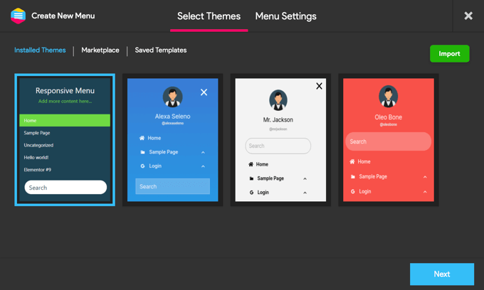
With that done, go to the Responsive Menu » Menus page and click on the ‘Create New Menu’ button.

You will now see a few different themes that you can use for your menu.
We’re using the ‘Default Theme’ in our images but you can use any theme you want. After making your decision, click on ‘Next.’
You can now type in a name for the menu. This is just for your reference so you can use anything you want.
With that done, click on ‘Link WordPress Menu’ and choose the menu that you want to use.
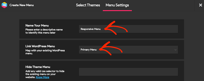
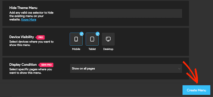
As already mentioned, if your theme already has a built-in mobile menu, then you’ll need to add its CSS class to the ‘Hide Theme Menu’ field.
If you upgrade to the premium plugin, then you’ll get a few additional settings. For example, Pro users can hide the menu on particular pages or devices.
When you’re happy with how the menu is set up, click on ‘Create Menu.’
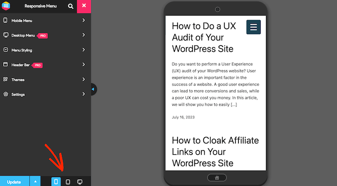
You’ll now see a preview of your WordPress website on the right of the screen, and some settings on the left.
To see how your site looks on mobile, click on either the mobile or tablet icon towards the bottom left of the screen.
To customize how the menu looks and acts on mobile devices, select ‘Mobile Menu.’
Then, click on ‘Container.’
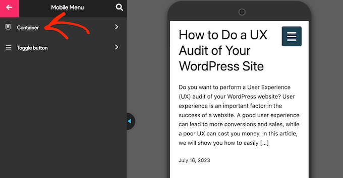
Here, you’ll find lots of different settings.
As you make changes, the live preview will often update automatically. With that in mind, it’s a good idea to expand the menu so you can monitor how your mobile menu will look. To do this, simply click on the menu toggle button.
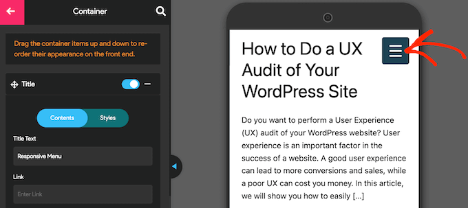
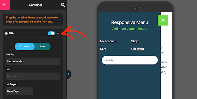
By default, the plugin adds a title and some ‘Add more content…’ text.
You can replace this with your own messaging, or even remove the text completely. To edit the title, click to expand the ‘Title’ section.
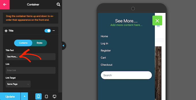
You can now type your own messaging into the ‘Title Text’ field.
You can also add a link to the title, or add icon fonts and images.
To customize how the title looks, click on the ‘Styles’ tab.
Here, you can change the background color, the text color, the font size, and more.
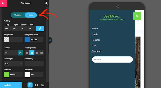
If you don’t want to show any title text, then click to deactivate the toggle next to ‘Title.’
If the title isn’t essential, then removing it will create more space for the links and other content in your mobile navigation menu.
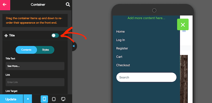
To replace the ‘Add more content here….’ text with your own messaging, click to expand the ‘Additional Content’ area.
You can now type in your own text, change the text color, change the text alignment, and more by using the settings in the left-hand menu.
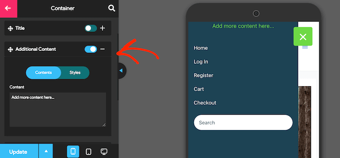
To remove the text completely, simply click to deactivate the toggle.
Once again, this can create more room for the rest of the menu’s content. This is particularly useful on smartphones and tablets, which typically have smaller screens.
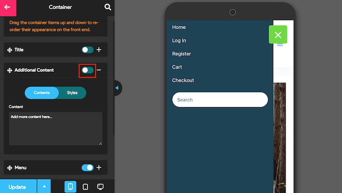
By default, Responsive Menu will show all your menu items as a single list. However, you may prefer to show these links in multiple columns. This can work well if your menu labels are shorter, as it allows you to show more items in a smaller amount of space without the menu looking cluttered.
To try different column layouts, click to expand the ‘Menu’ section.
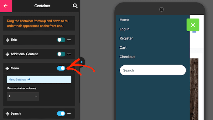
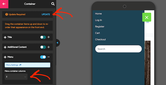
You can now open the ‘Menu container columns’ dropdown and choose the number of columns you want to use.
At this point, you may see some ‘Update Required’ text. If you see this message, then give it a click to update the live preview with your new column settings.
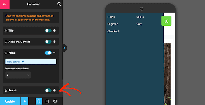
By default, Responsive Menu adds a search bar to your WordPress menu. This can help visitors find interesting content, but it can also take up precious onscreen space.
If you prefer, then you can remove the search bar for mobile users by deactivating the toggle next to ‘Search.’
There are lots more settings that you can configure, so you may want to spend some time looking through the other options. However, this is enough to create a well-designed mobile-ready menu.
When you’re happy with how the navigation menu is set up, click on ‘Update.’
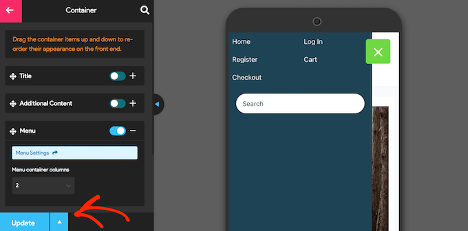
Now, simply visit your WordPress blog using a mobile device, to see the new menu in action. You can also view the mobile version of your WordPress site from desktop.
Another option is to add a fullscreen responsive menu. This is a menu that automatically adjusts to different screen sizes, so the navigation menu will always look good no matter what device the visitor is using.
Since the menu takes up all the available space, it is easier to navigate on smartphones and tablets, no matter how small the screen.
The easiest way to create a fullscreen menu is by using FullScreen Menu – Mobile Friendly and Responsive. This plugin allows you to create a fullscreen menu for mobile devices only, or you can show the same menu across smartphones, tablets, and desktop computers, so all visitors have the same experience.
The first thing you need to do is install and activate the FullScreen Menu plugin. You can check our step-by-step guide on how to install a WordPress plugin for more details.
Upon activation, select Fullscreen Menu Options from the WordPress menu and check the following box: ‘Activate Animated Fullscreen Menu.’
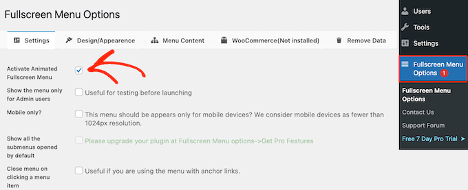
We also recommend checking the ‘Show the menu only for Admin users’ box. This allows you to see the changes as you’re configuring the menu, but visitors won’t see the mobile menu until you make it live.
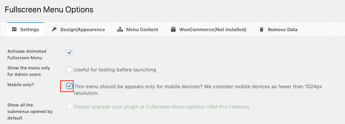
By default, the plugin will show the fullscreen menu on all devices. If you want to show the fullscreen menu on smartphones and tablets only, then check the box next to ‘Mobile only.’
With that done, you’re ready to fine-tune how the menu looks by clicking on the ‘Design / Appearance’ tab.
Here, you can choose the colors, font, and animation settings for the fullscreen menu.
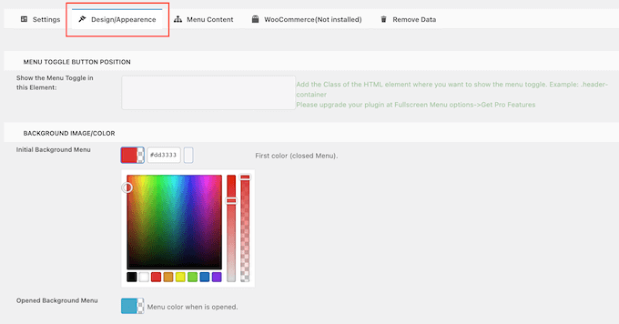
When making these changes, just be aware that ‘Initial Background Menu’ is the menu’s toggle icon. Meanwhile, ‘Opened Background Menu’ is the color of the expanded, fullscreen mobile menu.
After choosing the menu colors, scroll to the ‘Menu Appearance’ section. Here you can change the menu’s font color, font family, and font size.

Just be aware that loading additional fonts could affect your WordPress site performance and speed. This isn’t always a good choice for mobile devices, which typically have less processing power compared to desktop computers. Some visitors may also have a poor mobile internet connection, which will make your site load even more slowly.
With that done, scroll to ‘Animation Settings.’.
To start, you can choose how the menu will expand when a visitor clicks the toggle icon. Simply open the ‘Animation Type’ dropdown menu and choose an option from the list, such as From Top to Bottom or From Left to Right.

When you’re happy with how the menu is set up, it’s time to add some content by clicking on the ‘Menu Content’ tab.
Here, go ahead and open the ‘Select Menu’ dropdown and choose the menu that you want to show fullscreen.
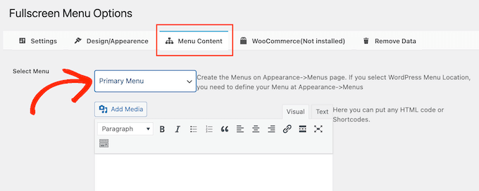
If you haven’t created a navigation menu yet, then check out our guide on how to add navigation menus in WordPress.
If you want to show additional content in the menu, then you can add it in the ‘Free HTML / Shortcodes’ box. This acts as a mini page editor so you can type in text, change the formatting, add bullet points and numbered lists, and more.

There’s also a checkbox that will add a link to your privacy policy page.
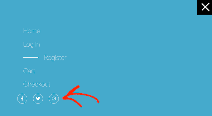
Next, you might like to add social media icons to your WordPress menu. These icons will appear in a row at the bottom of the fullscreen menu.
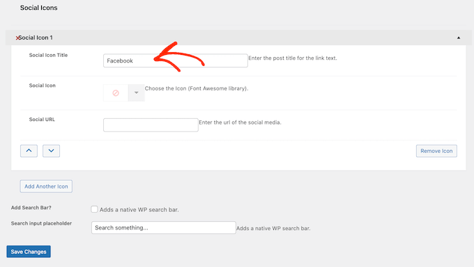
To add these icons, simply click to expand the ‘Social Icon 1’ box.
You can now type in a title for the icon, such as ‘Facebook.’
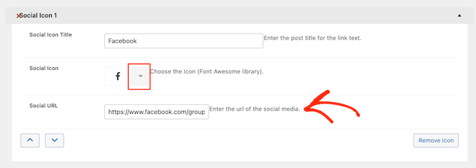
After that, click on the arrow next to ‘Social Icon’ and choose the icon that you want to show to mobile visitors.
Finally, type the address you want to use into the ‘Social URL’ field.
To add more icons, simply click the ‘Add Another Icon’ button.
Finally, you may want to add a WordPress search bar to help visitors find what they’re looking for. To do this, simply check the box next to ‘Add Search Bar.’

By default, the plugin will show a ‘Search something…’ message. However, you can replace this with your own custom messaging by typing into the ‘Search input placeholder’ field.
For example, if you run a WooCommerce store then you may want to use text such as ‘Start shopping’ or ‘Search for products.’
When you’re happy with how the menu is set up, click on the ‘Save Changes’ button.

Now, simply visit your website using a mobile device to see the fullscreen menu in action.
You can also preview the mobile version of your website using the WordPress theme customizer.
Bonus: How to Add a Mobile-Responsive Menu to Landing Pages
If you’re creating a landing page or sales page, then you’ll want the design to look just as good on mobile devices as it does on desktop.
With that in mind, we recommend creating the page using SeedProd. SeedProd is the best page builder plugin and comes with more than 180 professionally-designed templates.
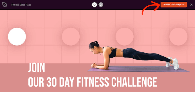
After creating a design using SeedProd, you can add a mobile-responsive menu to the page using SeedProd’s ready-made Nav Menu block. This block allows you to create separate menus for both menu devices and desktop.
In this way, you can use a different layout and even show different links depending on the user’s device.
To learn more, please see our guide on how to add custom navigation menus in WordPress.
After adding the Nav block to your design, simply click on the ‘Advanced’ tab.
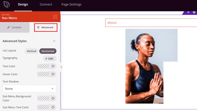
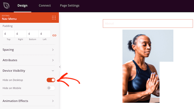
Here, click to expand the ‘Device Visibility’ section.
After that, click on the ‘Hide on Desktop’ toggle to activate it. Now, this menu will only appear on mobile devices.
You can now add links and change the menu’s layout using the settings in the left-hand menu.
We hope this article helped you learn how to create a mobile-ready responsive WordPress menu. You may also want to see our guide on how to increase your blog traffic, or see our expert pick of the best analytics solutions for WordPress users.
If you liked this article, then please subscribe to our YouTube Channel for WordPress video tutorials. You can also find us on Twitter and Facebook.

